“My father always said, ‘Never trust anyone
whose TV is bigger than their book shelf.’”
-Emelia Clarke
Book Covers
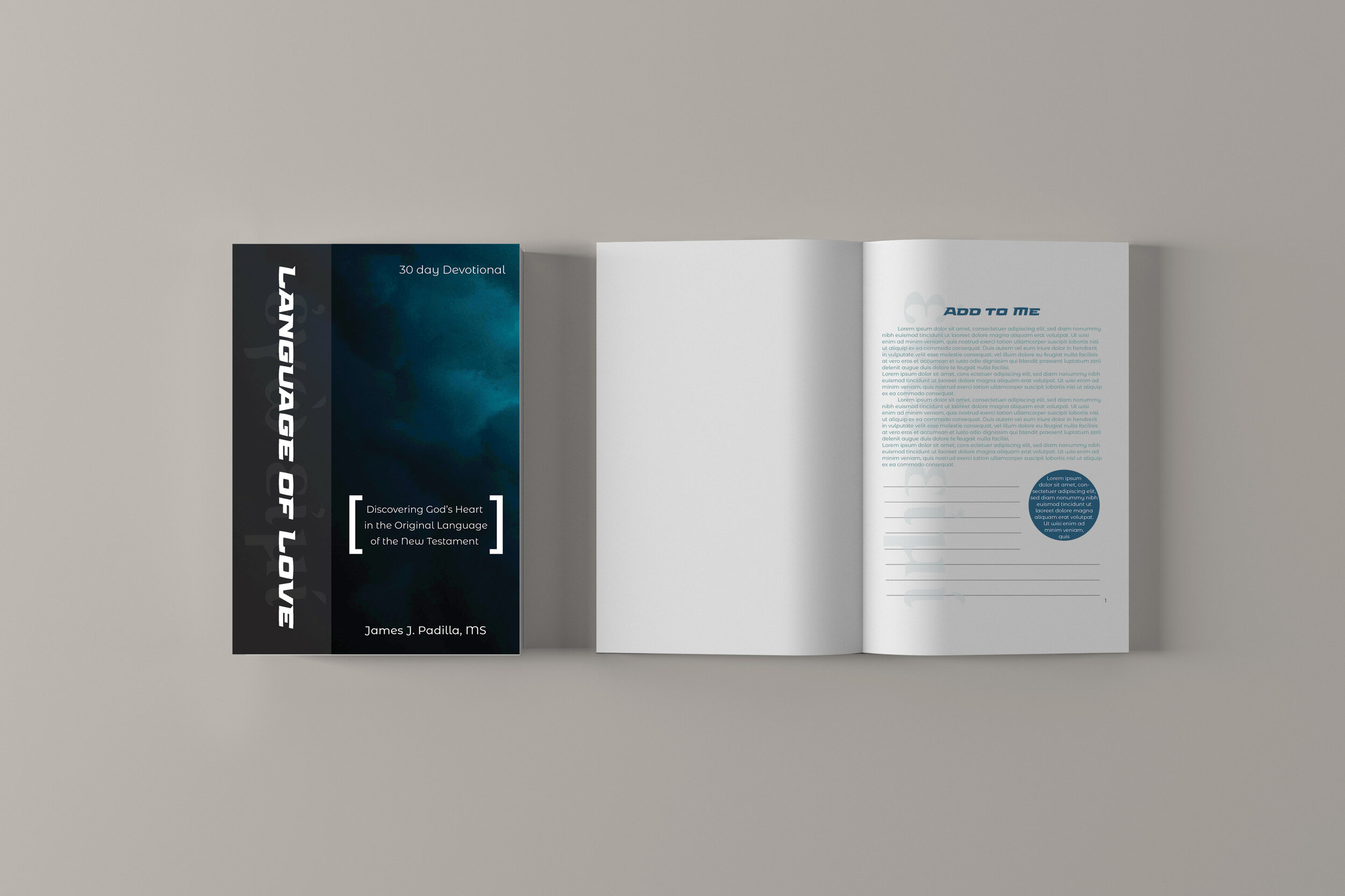
The devotional came together rather quickly, the client is involved but didn’t have many demands on what it should look like. The goal was to create a clean, minimal design that appeals to all. The design was chosen to convey the concept of bringing light to some of the revelations within God’s word that were lost in translation, I did this by using a color palette with strong contrast. The client also wanted the Greek text meaning “I am” to be featured in the page design behind the text, I chose to add it to the cover for consistency.
The mood board I chose to make utilizing images of different forms of water in reference to the scripture John 4:10 where Jesus refers to Himself as “living water.”
—
The cookbook was more challenging due to it being a redesign, the goal was for it to be reminiscent of the original with a fresh twist. The client wanted a green color palette, and The Philosopher’s Garden summit image needed to be incorporated. I sought to communicate the idea of a traditional garden with original photography from a market in Florence, Italy. Included in the mock up is an insert of the original design created by the client to convey why I made some of the design decisions and how problems were solved.


